EduFarming
Your list · 0हिं

Type at least two letters. Press Esc to close.

↑↓ navigate↵ openTAB cycle filter

Employment: Formal & Informal Work · Question 31 of 58

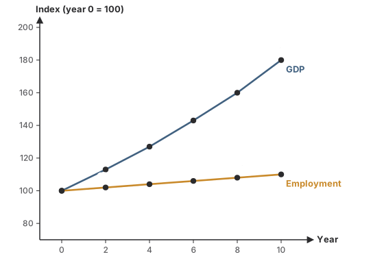
What does the graph shown illustrate?

Question 31

MediumOriginal question

What does the graph shown illustrate?

A line graph of an economy's GDP and employment as indices, year 0 = 100. GDP: 100, 113, 127, 143, 160, 180 in years 0, 2, 4, 6, 8, 10. Employment: 100, 102, 104, 106, 108, 110.
Options for question 31

Show the answer and explanation
CorrectNot quiteAnswer C

Correct answer: C

Explanation

  1. Output rises steeply while employment barely moves: that is jobless growth.

Concept
Jobless growth
Typical time
70 s
Your time
—
The rule this testsJobless growth and casualisation
Practise this chapter →

Ten questions from Employment: Formal & Informal Work, at your own pace.

Practise this chapter →

Ten questions from Employment: Formal & Informal Work, at your own pace.